Color Harmony: Principles
Bridget Riley {1} distinguished between pictorial color (color needed to make a picture) and perceptual color (everyday experience of color: as it actually is). Artists have to work with both, recasting their sensations in pictorial terms.
Artists also need a method, a way of creating their pictorial reality. Color theory basics became an important support in the nineteenth century, but its concepts were not consistently applied, and were not always correct. (It's also worth stressing that there is no unchallengeable principle of color, nor firm conceptual basis to picture making — which may be just as well, as each artistic sensibility can then make its unique expression.)
History of Color
Nonetheless, some trends or general principles are apparent in European painting: {1}
Titian was the first artist to create such a spatial structure with color alone. His pictorial unity was made with color relations, by modulating and picking up the same color in various tones and hue variations throughout a painting — always bearing in mind that colors created by juxtapositions have also to create a unity.
Veronese and then Watteau adopted some of Titian's practices, using decoration, fabrics, architecture and objects as agents carrying color around their pictures. Rubens carried the components of his skin tones to other objects in his paintings.
Caravaggio introduced a workable formula, simplifying color to chiaroscuro. Tone was divorced from color, readily lending itself to engraving and teaching, a conception that held sway in European art until the nineteenth century.
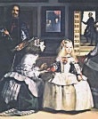 Velasquez
appeared to be using chiaroscuro but in fact used
grays as colors, hovering between warm and cool
to create space.
Velasquez
appeared to be using chiaroscuro but in fact used
grays as colors, hovering between warm and cool
to create space.
Vermeer brought primaries (yellow and blue) together in a focus of interest and then spread them out into other parts of the painting. Poussin does something similar, finding some dominant color chord to orchestrate around.
Delacroix worked out his color schemes prior to painting, often years before. Commonly he used the greatest tonal contrast when color was diminished, and least contrast when colors were strong.
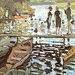 Monet
and Impressionists {2} used what they called a perceptual
'enveloppe' - typically a representation of light
and air by pairs of complementaries which induced
colors by interaction, and a secondary interaction
between induced colors and primaries. There might
be three or more pairs in each painting, these being
used to represent the sensations the painter actually
experienced in front of nature. Violet for shadows
was much ridiculed, and in fact (contrary to theory)
a simple black was often used.
Monet
and Impressionists {2} used what they called a perceptual
'enveloppe' - typically a representation of light
and air by pairs of complementaries which induced
colors by interaction, and a secondary interaction
between induced colors and primaries. There might
be three or more pairs in each painting, these being
used to represent the sensations the painter actually
experienced in front of nature. Violet for shadows
was much ridiculed, and in fact (contrary to theory)
a simple black was often used.
Seurat and the Pointillists grouped colors into five categories: local, direct reflected light, partially reflected/absorbed light, local color and ambient complementary color In practice, however, Seurat employed just two principles: he increased the contrast of tone at meeting of dark and light objects, and used complementary colors placed in dots side by side.
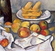 Cezanne
created pictures with a single, dislocated plane,
orchestrating color and simplifying shapes to do
so.
Cezanne
created pictures with a single, dislocated plane,
orchestrating color and simplifying shapes to do
so.
The Cubists used the simple shapes but opened up depth again by color
Matisse argued that if the precise character of sensations could be represented by color, then the procedure could be reversed, pictorial color creating its own sensations.
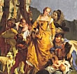 Tiepolo
used complementary and split-analogous for preference,
but usually added a further color to give variety.
Purple was rarely used. Colors tended to be sharp
or acid. Highlights (white usually) made up 10-15%
of area, and were used for composition and contrast.
Whites were rarely pure but generally creamy, greenish,
etc. High-lit areas were always serrated with shadow
and boldly painted to give energy and movement.
Dark tones made up 10-15% of area but did not play
any part in composition: used for modeling and to
some extent contrast. Key to composition was tertiaries
— about 40% of area — which link the purer
colors In 'The Finding of Moses' (opposite)
we see the gradation from gray-green robe to gray-green
vegetation of background to yellowish-gray-green
of dress in shadow to green-yellow of shadowed dress
to bright yellow dress of queen (central character).
The pink lining of the dress links through flesh
tints to scarlet tunic of jester: deep blue of dress
of LH figure links through paler blue of dress of
RH figure to cerulean blue of sky and palest blue
of cloak of figure behind queen.
Tiepolo
used complementary and split-analogous for preference,
but usually added a further color to give variety.
Purple was rarely used. Colors tended to be sharp
or acid. Highlights (white usually) made up 10-15%
of area, and were used for composition and contrast.
Whites were rarely pure but generally creamy, greenish,
etc. High-lit areas were always serrated with shadow
and boldly painted to give energy and movement.
Dark tones made up 10-15% of area but did not play
any part in composition: used for modeling and to
some extent contrast. Key to composition was tertiaries
— about 40% of area — which link the purer
colors In 'The Finding of Moses' (opposite)
we see the gradation from gray-green robe to gray-green
vegetation of background to yellowish-gray-green
of dress in shadow to green-yellow of shadowed dress
to bright yellow dress of queen (central character).
The pink lining of the dress links through flesh
tints to scarlet tunic of jester: deep blue of dress
of LH figure links through paler blue of dress of
RH figure to cerulean blue of sky and palest blue
of cloak of figure behind queen. 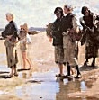 John
Singer Sargent (1865-1925) Painted genre, landscapes
and portraits in oil and watercolor (2500 works),
but is best known for portraits (700). He was very
popular with Americans and the nouveax riche, whom
he invested with presence and panache. Painting
from early age, he studied under Carolus-Duran,
and was painting acceptable portraits by 1879. His
'Oyster Catchers of Cancale' (opposite, 1879)
looks Impressionist, but is in fact solidly based
on studio traditions — deft brushwork, dark
colors and glazes. Sargent had made his name by
the later 1880's, after the notorious 1884 portrait
of Mme Gautreau. The color scheme was simple: often
complementaries or split complementaries with a
good deal of chiaroscuro. Sargent was a great socialite
(though shy), an excellent musician, intelligent
and well read in four languages. A painter in the
tradition of Velasquez and Hals, using the gesture
to delineate style and character, his success aroused
great envy among younger generations and he was
denounced as slick and superficial after his death.
John
Singer Sargent (1865-1925) Painted genre, landscapes
and portraits in oil and watercolor (2500 works),
but is best known for portraits (700). He was very
popular with Americans and the nouveax riche, whom
he invested with presence and panache. Painting
from early age, he studied under Carolus-Duran,
and was painting acceptable portraits by 1879. His
'Oyster Catchers of Cancale' (opposite, 1879)
looks Impressionist, but is in fact solidly based
on studio traditions — deft brushwork, dark
colors and glazes. Sargent had made his name by
the later 1880's, after the notorious 1884 portrait
of Mme Gautreau. The color scheme was simple: often
complementaries or split complementaries with a
good deal of chiaroscuro. Sargent was a great socialite
(though shy), an excellent musician, intelligent
and well read in four languages. A painter in the
tradition of Velasquez and Hals, using the gesture
to delineate style and character, his success aroused
great envy among younger generations and he was
denounced as slick and superficial after his death.