Art History: Themes
Paintings are the products of a certain time and certain place, and art history naturally attempts to place these works in their larger setting. Anyone studying western art, for example, will learn to recognize the styles of the Renaissance, Baroque, Classical, Romantic and Modern periods, and to understand the complex interplay of thought, patronage, society and economic issues that the paintings represent. It is to such an understanding that art critics refer when they insist that art today must engage with contemporary issues.
 For
painters, there are certain difficulties, however:
For
painters, there are certain difficulties, however:
1. History is written retrospectively, and it was not always so clear to contemporaries who or which were the important names and themes.
2. The picture is over-tidy, and does not allow for very different work within the same period: Rubens, Rembrandt and Vermeer, for example.
3. Art history is also subject to changing fashions: compare books written in the 1940s to those of today.
4. By ranking artists by significance, historians sometimes seem to imply that only the great names offer something of interest today, which is far from the case. Great artists excelled in certain ways, but also made fudges and botches in their work like everyone else. Students need to get beneath the labels of ''genius', and understand the discrete, practical matters at issue.
5. Art history deals with concepts that are nebulous and of secondary importance to the actual application of paint. What vitally concerned artists — the creation of a pictorial reality that provided employment, direction and significance to their lives — requires another approach.
5. Writing is a verbal exercise, and painters think in more visual terms. That is why contemporary artists do not generally read the gallery blurbs or newspaper articles: they are of little use to them.
Western Art: A Four-Fold Development
Though not without its own problems, and somewhat over-simple, Brian Thomas's {5} approach did attempt to deal with painting as painting. He grouped the history of European painting into four overlapping stages:
Line design
Woven out of relationships of shape and outline. Dominant between decline of Roman Empire and Renaissance. May be unrealistic (Book of Hours) or realistic (Flemish Gothic). Legible element distinct from illusionist. Stereotype and non-personal symbols generally employed. Outlines emphasized by color changes. Areas filled by pattern. Popular for narrative, when features irrelevant to storytelling are omitted. Hidden geometry important. Flowing brush strokes only in illuminated MSS (unlike far-eastern art.) Development from late Roman to Byzantine and to Gothic is not based on direct observation. Symbols are distorted for religious effect. Important artists appearing at end of period include:
-
Jan van Eyck. Painted direct from nature, capturing illusion of space and pattern of light and tone relationships. Worked by
-
modeling light and shade in opaque pigment (probably egg-oil emulsion)
-
covering with more or less transparent glaze, and
-
working over light side of forms and half shadows in thin films of opaque paint.
-
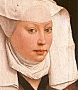
Holbein. Worked by:
-
Interpreting form by contour lines of great simplicity and subtlety. Lines built of short lines infinitely sensitive to change in direction of surface planes.
-
Blending flat pattern and realistic rendering of surface quality of clothes and flesh.
Form Design
Involved the third dimension, often running in counterpoint to a line design as well. Both decorative and descriptive. Intricate and subtle patterns built up by interweaving forms in space, speeding up, slowing and stopping the recession as desired. Artist studied nature to elucidate construction of forms in space, and to relate them rhythmically. Construction uses tone or line, the latter indicating axial and sectional lineaments. Perspective helps. Artists think in the round. Significant artists:
Giotto and Cavallini introduced form design. Giotto observed nature closely and used broad form-design to create monumental and moving tableaux-vivants.
Masaccio dispensed with the wiry outline of Giotto and used tonal gradation to place his figures in a realistic setting. Tones due to local color are repressed.
Piero della Francesco. Further mastery of perspective — used decoratively, to lend cogency to surface pattern. Recession muted and controlled. Figures static.
Signorelli. As Masaccio, but introduced strong, often overemphatic modeling into both lights and shadows, exaggerating the modeling in the shadows by stressing reflected light.
Filippo Lippi and Botticelli stressed sinuous lines in slender, mobile forms.
Pollaiuolo popularized the nude, introducing the sinewy strength found in Donatello's sculpture.
Fra Angelico brought realistic blue skies into general use.
Giorgione introduced atmosphere, a feeling for the weather. Aim was to give enduring satisfaction on prolonged contemplation, rather than intense but transitory emotion.
Leonardo. Variety of interests left little time for painting. Works important for a. penetrating understanding of the construction of natural objects, b. sensitivity to rhythmic flow of forms in nature and c. subordination of color to delicate gradations of light.
Michelangelo. Depicted vigorous, contrasted action in bulging muscles and swinging draperies. Modeling subtle, but main figure often silhouetted in strong tonal contrasts.
Raphael. More successful than Michelangelo in architectonics of groups of figures. Supremely intelligent artist, learning from others.
Correggio foreshadowed the Baroque. Smooth, rounded forms, suave and undulating rhythms, caressed with soft lighting all set a mood — helped by paint quality, tonality, color, stylization and choice of motive.
Tiepolo was decorative, creating intricate interplays of line from "theater flats" and foreshortened figures.
Poussin. Used illustration as a pretext for pictorial architecture, perfect in proportion and rhythmic articulation. Dry style, remote subjects, but he avoided heaviness by a. exaggerating luminosity and reflected light in shadows and b. playing off strong contrasts of tone against subtle ones.
Tone Design
Aimed at a. creating a satisfying pattern out of degrees of light and shade and b. representing perceptual truth more closely by some pictorial convention that represents the eye's varying sharpness of focus. Lasted early 16th to early 19th centuries. Artists were more concerned with tone than color. Where important, as in Venetian painting, color was generally used decoratively. Willingness to sacrifice detail in areas 'out of focus' meant that brushwork could vigorous and free, adding life and sparkle to the painting. Significant artists:
Leonardo blended outlines in his Mona Lisa.
Gentile and Giovani Bellini, using oil on canvas to avoid corrosive effect of sea air, had a good sense of paint quality which led to an appreciation of tonal values.
Giorgione absorbed the poetic mood and love of landscapes of the Bellinis, but composed his paintings as a whole, with only such detail as was needed.
Titian achieved a complete mastery of all expedients of tone design — slowly, intuitively, after much experimentation and fumbling. He created a new type of feminine beauty, used richer, juicier color, graded his brushstroke according to importance of what was being depicted, and used a variety of compositional means, often reducing depiction to extreme simplicity that would inspire Velasquez and Hals.
Tintoretto used a greater range of tone and more forced lighting.
Veronese introduced a greater realism and sumptuous, decorative color
Caravaggio created a. stark realism and vivid characterization, b. sharp contrasts and c. mood of drama and mystery.
Rubens. Eclectic. Supreme master of rhythmic movement. Combined realism with nobility and decoration. Great vitality and creativeness. Opulent color
El Greco. Fluent and hallucinatory rhythms. Used colored glazes over monochrome.
Velázquez. Consummate artist. Simplified color to produce effective tonal patterns. Always efficient painter: interprets rather than creates.
Hals. Produced animated portraits by lively brushwork, high tonality and crisp tone patterns.
Vermeer. Great sensitivity to light, with a strain of poetry.
Rembrandt. Took Caravaggio's dramatic and poetic potentialities to the limit. Great sense of form. Consummate craftsman. Compassion for suffering humanity.
Goya. Creator. Great tone designer, but often careless and hurried, using knife and dry brush.
Van Dyck. More febrile and haughty than Rubens: more refinement and poetry but used a flat nut oil that reduced the scale, richness and atmosphere of his mentor.
Watteau. Painted jeweled world of imagination with iridescent, atmospheric qualities that Van Dyck neglected. Graceful drawings unsurpassed for analytical clarity.
Boucher. Artificial scenes, slightly acid color, but suavely classical and showing perfect artistic tact.
Hogarth. Moralist whose art is securely based on Baroque tone design, with a particularly crisp handling of paint.
Gainsborough. Natural painter. Work is play between nebulous films of paint drawn with tip of sable brush and racy passages of loaded brushwork. Thin paint has exceptional fluency of brushwork that avoids poor appearance.
Reynolds. Excelled in use of decorative tone. Rich color His 'Discourses' among the best of art criticism. Fresh handling of paint was an inspiration to Constable and French School, but his experimentation in materials was generally unfortunate.
 Final
stage in cycle of pictorial realism. Color had
always played an important part in painting but
not until nineteenth century were painters prepared
to make drastic sacrifices on tone and precise
delineation. Harmony was the object — achieved
by some relationship of warm and cold (i.e. red
or blue bias) or color saturation (e.g. a brilliant
orange, dark brown, warmish gray and flesh pink
are all orange either neat, reduced in tonal intensity,
desaturated and reduced in intensity and desaturated
respectively — i.e. orange with nothing,
black, gray or white added.) Form tended to be
lost and dim interiors were banished for bright
landscapes. Finest landscape school was the English
of first half of nineteenth century — helped
by Rubens' experiments, atmospheric renderings
of Poussin and Claude, and rustic motifs from
Dutch painters. Significant artists:
Final
stage in cycle of pictorial realism. Color had
always played an important part in painting but
not until nineteenth century were painters prepared
to make drastic sacrifices on tone and precise
delineation. Harmony was the object — achieved
by some relationship of warm and cold (i.e. red
or blue bias) or color saturation (e.g. a brilliant
orange, dark brown, warmish gray and flesh pink
are all orange either neat, reduced in tonal intensity,
desaturated and reduced in intensity and desaturated
respectively — i.e. orange with nothing,
black, gray or white added.) Form tended to be
lost and dim interiors were banished for bright
landscapes. Finest landscape school was the English
of first half of nineteenth century — helped
by Rubens' experiments, atmospheric renderings
of Poussin and Claude, and rustic motifs from
Dutch painters. Significant artists: By
the beginning of the twentieth century, this fourfold
evolution had run its course, leaving artists with
no obvious avenue for development (nor a proper
role in society). The School of Paris therefore
chose experimentation, producing work with the following
characteristics:
By
the beginning of the twentieth century, this fourfold
evolution had run its course, leaving artists with
no obvious avenue for development (nor a proper
role in society). The School of Paris therefore
chose experimentation, producing work with the following
characteristics: