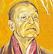
Portraits: Painting on a Dark Ground
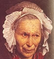 Solomon {5} suggests
these steps for portrait painting:
Solomon {5} suggests
these steps for portrait painting:
1. Make an accurate sketch in
charcoal. Ensure this is correct.
2. Model tones only in turps-thinned
raw umber and white.
3. Repeat stage 2 several times until
modeling is correct. Each attempt should completely but thinly cover
the previous. Pay attention to hard and soft edges, skin over bone and
pulpiness elsewhere. Tone should be appreciably lighter than intended
result dark grounds tend to absorb mid-tones and darken with age.)
4. Dry thoroughly.
5. Paint shadows in a mixture of
Indian red and black, highlights with stiff white, and intermediate
tones with a mixture of these colors modified with a cobalt or a very
little chromium oxide green.
6. Dry thoroughly.
7. Glaze and/or scumble this grisaille
with red and yellow pigments, either in oil, or oil and glazes mixed.
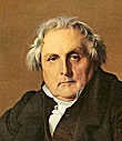
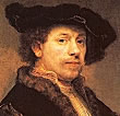
Portraits: Painting on a Toned Ground
The following approach is more
general, and emphasizes the need to a. work out everything in advance
and b. undertake oil sketches to solves problems as they arise.
1. Prepare ground properly: absorbent
if you are using much medium with paint, less absorbent if you're using
glazing approach. Grays, greens, pinks, browns and buffs colors are
best, all pale.
2. Decide composition beforehand,
either by roughing out in charcoal or by tonal drawings.
3. Work out palette prior to painting
anything, and decide in this order: skin tones, then hair, then clothes
and finally background. Adjust tone/hue/purity of color in clothes as
necessary. You may need to make many oil sketches to harmonize
everything.
4. Use lateral frontal lighting.
Shadow pattern should aid composition.
5. Ensure movement of body does not
follow that of head.
6. Make background some neutral color,
not necessarily darker than shadows of head.
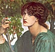
Portraits in Oil: Specific Hints
 There is no "correct" approach, but many
authorities suggest something like this:
There is no "correct" approach, but many
authorities suggest something like this:
1. Paint shadows to define broad
structure, starting with nose.
2. Lower value in lower half of
lighted area to help highlights above.
3. Make muzzle area the same color as
rest of flesh but cooler.
4. Add touch of color where shadow
meets light.
5. Try Venetian red as alternative to
raw sienna which loses intensity with white. Paint hands etc. with
these two colors and white.
6. Use cadmium colors for fair
complexions, and earth colors for swarthy.
7. Shadows should be similar to
background colors.
8. Add background colors to flesh
tones to make area recede.
9. Tonal range of hair (light to dark)
is often that of eye (highlight to pupil).
10. Highlights pick up structures and
have to end on them.
11. Start with shadow areas. Cadmiums
with black/cobalt blue/ultramarine and umber make good shadows. Deepen
shadows if face lacks structure.
12. Break the face into planes, assign
tones of one hue to these planes and paint them simply.
13. Warm skin areas always have a
little cool color, and vice versa. But keep the light areas and the
shadows distinct.
14. Thick flesh areas are warm and
bone areas are cool.
15. Bring cheeks and chin forward with
warm colors
16. Create warm backgrounds by taking
shadow color and both lighten its value and weaken its
intensity/purity.
17. Create cool background by choosing
the cooled gray color that will represent the turning planes of your
object. Cool with raw or burnt umber or with a little cobalt blue.
18. Don't let backgrounds overpower
subject: make them more neutral to make subject come forward.
Portraits: Palette
 Many mixtures are recommended,
but it's essential not to mix more than three pigments plus white if
brilliancy is to be retained. A little blending is acceptable but much
better is to apply patches of paint with flat or filbert brushes and
leave alone. Remember that shadow areas are an extension of the lit
side, so use the same ingredients but vary proportions slightly.
Many mixtures are recommended,
but it's essential not to mix more than three pigments plus white if
brilliancy is to be retained. A little blending is acceptable but much
better is to apply patches of paint with flat or filbert brushes and
leave alone. Remember that shadow areas are an extension of the lit
side, so use the same ingredients but vary proportions slightly.
Abbreviations in the mixtures that
follow are:
Titanium White =
W Cad. Light Yellow
=clY Cad. Yellow =
cY Cad. Orange =
cO
Cad. Light Red = clR Cad. Deep Red = cdR
Alizarin Crimson = acR Permanent Rose =
pmR
Venetian Red = vR Rose Doré = rdR
Permanent Rose =
prR Permanent mauve =
pM
Yellow Ochre =
oY Naples Yellow = nY
Cobalt Blue =
cB Ultramarine = uB
Prussian blue = pB
Phalo Blue = phB
Cerulean blue = ceB
Viridian =
vG Payne's Grey = PG
Raw Sienna = rS
Burnt Sienna = bS Raw Umber = rU Burnt Umber
= bU
These are some recommendations in
books devoted to the art of portraiture.
Basic Oil Painting {1}
General complexions: W + rS + clR +
cB
Softer general complexions: W + rS + V
/ cB
Children's complexions: W + nY + clR +
vG
Medium dark (yellow) complexions: W +
yO + bS + uB
Medium to dark complexions: W + rS +
pmR
+ cB
Red hair: W + cO + bS + pmR + cB
Dark brown hair: W + cO + bU + uB
Black hair: B + M + U
Gray hair: W + uB + cB
Parramon {2}
 These are taken from Parramon's
color schemes.
These are taken from Parramon's
color schemes.
Warm
Flesh Tints
Ordinary lit areas: W + clY +
clR + pmR + cB
Lower lip & rosy areas: W +
clY + clR
Highlights: W + clR + clY
Stubble: W + phB + cY + pmR
Blue-tinged shadows: W + phB
+cY +pmR
Basic shadow: clR+ cO +phB + W
Darker shadow: clR + cO +
cY + phB + pmR + W
Upper lip: pmR + vG
Eyebrows pmR +uB +phB +vG
Cold
Flesh Tints
Ordinary lit areas: W + Oy +
pmR + vG
Lower lip & rosy areas: W +
oY + pmR
+ vG
Light luminous flesh: W +
oY + vG
Stubble: W + oY + pmR + vG
Blue-tinged shadows: W + cB +
cO + pmR +bS
Basic shadow: c Y + cO + vG +
pmR + W
Darker shadow: vG V + W +
pmR
Upper lip: cY + cO + vG + W
Eyebrows pmR + vG +phB/bS
Angela Gair {4}
 Some of these may apply better to
watercolors. Experiment.
Some of these may apply better to
watercolors. Experiment.
Pale
complexions: W + cO + pmR
Pinker complexions: W +
cO + pmR + cB
Pale orange-pink complexions:
W + cO + pmR
Golden complexions:
W + bS + cO + vG
Mediterranean
complexions: W + cO + bS + cB
Brown complexions:
W + bS + cO + pmR
Chinese/ yellow
complexions: W + cO + vG
+ bS
Deeper brown
complexions: W + rU + bS + phB
Rich brown complexions: W + bS
+ cB
Cold black
complexions: W + rU + phB
Warm black complexions: W + rU
+ phB + pmR
Rosalind Cuthbert {9}
Very
Dark Complexions
Body: ccR + rU + prB
Shadows: acR + prB / acR +
vG / PG
Highlights: nY/cR + W / cB
+ W
Mid-brown
Complexions
Body: uB + cO + oY +
cO + W
Shadows: rU /uB / rU + clR
Highlights: cY + W / clY + W /
clR + W
Olive
Complexions
Body:
oY + W
Shadows: cdR + rU/
rS + cB/pM
Highlights: clY + W / cY
+ W / cB + W
Pale
Complexions
Body: cO + rdR + W
Shadows: cdR + cB / acR +
rU / cB + cdR
Highlights = W / nY / clY + W
The colours for highlights and shadows
are added to the body colours. Some of these combinations give
unpleasant or unhealthy-looking skin colours (Alizarin Crimson in
particular) : vary the proportions or substitute with similar colours.
Raw Umber may give 'dead spots': use Burnt Umber and a Blue.
 3. Create a souvenir, a loyal
remembrance of someone now absent or dead.
3. Create a souvenir, a loyal
remembrance of someone now absent or dead.  Most portrait artists begin with
drawings of the sitter. These do not supersede photographs, but are
generally preferred as the very act of drawing requires the artist to
study and understand what he is seeing. Nonetheless, there can be
problems. Some drawings will come off straight away, but many only
after a great deal of effort, and on occasions nothing seems to give a
likeness. For that reason, some painters, particularly the more
experienced, begin immediately on the oil portrait. By moving from
general appearance to telling details they avoid producing a
photographically correct but facile/bland/unilluminating facsimile of
the subject. Some general hints:
Most portrait artists begin with
drawings of the sitter. These do not supersede photographs, but are
generally preferred as the very act of drawing requires the artist to
study and understand what he is seeing. Nonetheless, there can be
problems. Some drawings will come off straight away, but many only
after a great deal of effort, and on occasions nothing seems to give a
likeness. For that reason, some painters, particularly the more
experienced, begin immediately on the oil portrait. By moving from
general appearance to telling details they avoid producing a
photographically correct but facile/bland/unilluminating facsimile of
the subject. Some general hints: