Why We Need Color Theory
Color theory is an immensely complicated subject, and is understood differently by scientists, printers, web designers and painters. Subtractive color (where mixing the hues will create black) is what oil painters generally use, and some grasp of the theory will help you understand:
1. Why some colors 'work' together, and others don't.
2. How paintings are designed: color is a vital element of composition.
3. The principles that have guided successful painters, and which are still useful.
4. How to mix colors — if only very broadly: pigments have individual properties.
Hue, Purity and Value
Colors are classified by three properties: hue, purity and value — terms that are often misunderstood. Experimenting with a graphics program will get the distinctions into your head, though colors mix differently on screen.
Hue
The intrinsic color; the wavelength of the light concerned. The strips shows primary, secondary and tertiary hues.
Purity
The freedom from other color admixtures. Saturation is the degree of purity. Chroma is the purity in relationship to gray. (N.B. Some authors also use intensity to mean color purity, whereas for others it means tone/value.)
Value
The luminance — brightness or dullness — of a hue, as measured by the amount of light reflected. Also called tone or tonal value.
A tint is made by adding white to a hue, and shade is made by adding black. As far as oil painting pigments are concerned, mixing in white or black will usually lower the purity of a hue, making it chalkier or muddier.
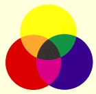
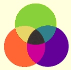
Primary, Secondary and Tertiary Colors
 |
 |
primary & secondary |
tertiary hues |
Red, yellow and blue are the primary colors, which can't be derived from still more basic colors. Mixing two primary colors will create one of the secondary colors: orange, green or purple. A secondary color mixed with an adjacent primary (on the color wheel) will create a tertiary color.
Color Warmth
Colors are also commonly described as warm or cold. Warm colors lie at the orange-red end of the spectrum, and are 'active', causing them to 'advance'. Blue colors, particularly when dark and/or undersaturated, are 'cool' and tend to 'recede'. Other areas of the spectrum remain neutral.
Mixing Colors
Color theory provides a only rough guide only to mixing paints. In practice you will need to:
1. Experiment to learn the individual properties of pigments and their mixtures, probably making reference charts to begin with.
2. Make more attractive tints and shades with colors other than white and black (e.g. light and dark earths).
3. Purchase pigments for the secondary and certainly the tertiary colors. Mixing primaries will only result in muddy hues.
4. Use glazes if you wish to modify colors without mixing them overmuch.
Color Harmony: Approaches
As always, the important thing is to see for for yourself — to study the great masterworks and experiment with their color schemes to understand what has been done and why. You can do that easily today by taking copies of the work (scanning books or using Internet sites) and analyzing them with a cheap graphics program.
There are indeed many schemes for color harmony, but the following should be useful to the painter. Note that they apply only to hues: for variety you can (and should) vary the purity and tones of the hues concerned.
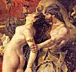
Monochrome
 One hue. Composition is achieved entirely
through adjusting purities and tones. A limited but powerful approach,
that always makes a good exercise.
One hue. Composition is achieved entirely
through adjusting purities and tones. A limited but powerful approach,
that always makes a good exercise.
In this detail from his 'Diana and Callisto' (1556-9. National Gallery of Scotland. Edinburgh), Titian has used a simple orange hue throughout, not far from that shown above in the color purity strip. The marvelous variety comes from modifying purity and tone with glazes and scumbles — which demonstrates the power of old master techniques. (The whole picture uses a wider color range, including blue and a pink-red.)
Complementary
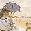 Composition
uses one hue and its complementary — e.g. blue and orange. The hues can
be mixed in various proportions, and tones added with white or black
(or preferably earth pigments).
Composition
uses one hue and its complementary — e.g. blue and orange. The hues can
be mixed in various proportions, and tones added with white or black
(or preferably earth pigments).
The detail comes from a famous painting by Monet of the 'Beach at Trouville' (1870). It was painted on the spot. Though seeming a careless, even clumsy, improvisatory sketch, it is nothing of the sort. Monet served a traditional apprenticeship, and is here playing off an orange in beach and flesh tones against chalky tints of blue.
Analogous.
 Composition
using just 3 hues of 12-color wheel - e.g. orange, orange-red and red.
As before, the hues can be mixed, and their tones adjusted.
Composition
using just 3 hues of 12-color wheel - e.g. orange, orange-red and red.
As before, the hues can be mixed, and their tones adjusted.
This scheme can be further divided into:
1. one pure hue and the other two semi-neutral (i.e. mixed, muddy, low intensity). The pure tone will advance more than the others, whether is warm or cold.
2. high key pure hues. Usually applied in a broken fashion so that hues of the same value shimmer when seen close to, but group to broad areas of color from a distance.
3. one dominant, one subordinate and one minor. The dominant is varied with different purities and values.
The detail is from Eugene Delacroix's 'Death of Sardanapolis'. 1826. Musée du Louvre. Paris. The whole picture employs an analogous color scheme of red, red-orange and orange.
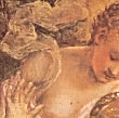
Split Complementary
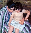 Like
analogous, but with the addition of the complementary of the mid-hue of
the analogous range. A warm/cool balance is more easily introduced with
this scheme.
Like
analogous, but with the addition of the complementary of the mid-hue of
the analogous range. A warm/cool balance is more easily introduced with
this scheme.
This intimate painting by Mary Cassatt ('The Bath'. c. 1892. The Art Institute of Chicago) uses tertiary hues, and falls somewhere between a triadic scheme and a split complementary one of red-purple against hues of green-blue. The background repeats the foreground colors but in muddier and darker colors.
Triadic
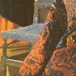 Uses all
three hues that are equidistance on color wheel. Hues may be varied in
purity and tone as usual, and the scheme is further divided:
Uses all
three hues that are equidistance on color wheel. Hues may be varied in
purity and tone as usual, and the scheme is further divided:
1. Primary colors only: very difficult to use outside posters and graphic design.
2. Secondary triadics, e.g. scarlet, mauve and viridian. Very beautiful effects can be achieved, probably because all colors contain some of the other two secondaries.
Green, blue and yellow appear in this detail from Vermeer's 'The Music Lesson' (c. 1664. HM The Queen's Royal Collection. St. James's Palace). Harmony has also been achieved by very skillful use of tone.
Other Considerations
Harmony is also achieved by using colors of similar purity or tonal value. The harmony is not generally an expressive one, however, and is more useful to industrial and graphic designers.